+1
I like many things on new mixer like more visible options, having a meter bridge on top, hiding channels etc, but there are far too many things which are too complicated now.
This clicking is absolutely unprofessional. Mixer shortcuts don’t work when not beeing in mixer, when beeing in mixer I change the size of the fader all the time, when trying to zoom in/out edit window. WHY should I be able to constantly zoom fader-size? Why not set this up in preferences and it’s done? I was absolutely fine with the old fashioned two sizes (still one more size than in “real life”).
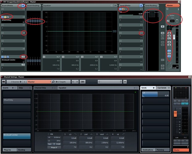
And then there is this new edit window, which used to be the most important overview for me. That’s over, since I can no longer customize the view of that window, and have to click(!) for other views. Trying to change insert routing means to click tabs and then: no overview of the plugins. So clicking back. Looking on which tab-number the plugin is inserted, then switching back to plugin-routing. What a hassle. And I still just do not understand WHY all this was changed, all the old functionality was simply dropped, instead for getting an operation system for nuage.
To repeat: There are really a few things I like in new mixer/ new Nuendo, but just not for the prize of loosing all my simple and clicking-free old workflows.
Domilik
