For comparison - Old Control Room:

The Control function is to take incoming signals and route them to outputs. Sounds like a mixer more or less. Because it is more or less. Compared to:

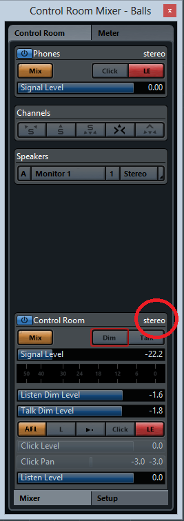
Wait, that’s not the control room, is it? Why yes it is, only it’s when you want to see the meter…
clickety click:
Horizontal sliders, not faders. Function name written right on top of the slider making it harder to read what the heck you’re looking at, instead of under the fader. And yet again more tabs - MORE CLICKING! Totally breaking with mixer and design convention.
In addition you can check this video:

at around 12:50 you can see a good example of the lack of visual feedback and requirement to click around to get crap done. Not to mention that the whole thing looks like a poorly designed Fisher-Price toy.
No comment of course…