Hi Lars,
I’ve spent a considerable amount of time with v2 before posting my message.
The new features are AWESOME!
Bug fixes are SIMPLY GREAT!
Ease of use is SUPERB!
Workflow is POWERFUL!
Pricing is FAIR!
Cubasis is second to NONE!
Steinberg RULES!!
Users on this forum, Audiobus forum and YouTube liked the new features/bug-fixes but NONE of them have talked about the UI except for one post where the user is appreciating the bug-fix about the zoom issue that v1 had in the Arranger. Users will take any app as long as it offers the features and workflow they are looking for and most of them will not complain about UI/UX.
I was only comparing the UI part of Cubasis 2.x with 1.x - particularly - 3D, soft background/text colors and rounded rectangles which made Cubasis 1.x so unique, ELEGANT and “easier” on the eyes. The background color in v2 is changed from Dark Slate to Dark Charcoal and the labels, etc were changed from Soft-Blue to BRIGHT white. Also the 3D/shadows and rounded rectangles were removed from title bars, tool bars, some icons, selected events, etc.
Here is the screenshot from v1 with 3D, Dark Slate BG color, Soft Blue labels, rounded rectangles, etc which is SOOTHING and ELEGANT:
NOTE: The toolbars on the top are in 3D raised with bottom shadows like real objects showing clear separation between the sections and very FUN to use.
Also, the title-bar of the effect is 3D that “sticks out” and offers a visual separation between sections.
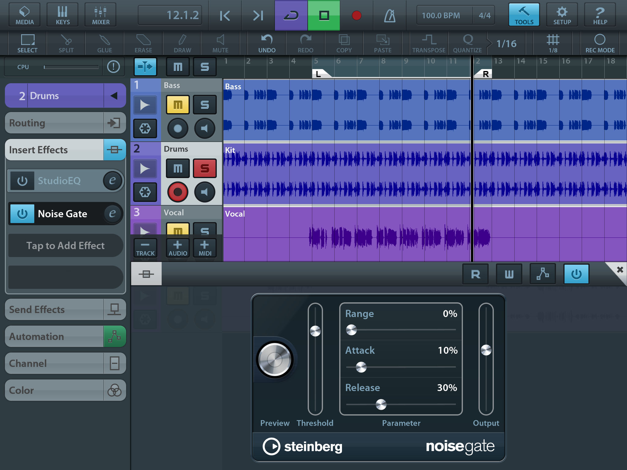
For a close comparison, I’ve whipped up a similar screenshot in v2 which is flat with square controls, Dark Charcoal BG color and BRIGHT white labels:
NOTE: The toolbars on the top are flat and Dark with no bottom shadows and almost blending with the section below it.
The toolbar for the effect is flat with no clear separation between sections.
The Effect Name (“noisegate”) in the footer-bar is missing for most of the effects. However, most of the effects in v2 still have Soft Blue text labels (from v1) which is COOL.
If you open the screenshots in above 2 URL’s in 2 separate browser windows and switch between them, you can clearly notice that v2 screenshot is BRIGHT, NOISY and HARD on the eyes compared to v1 screenshot which is SOOTHING, ELEGANT and EASY on the eyes (which adds to the UX factor).
Keyboard in v1 with 3D toolbar above it:

Keyboard in v2 with flat toolbar above it:
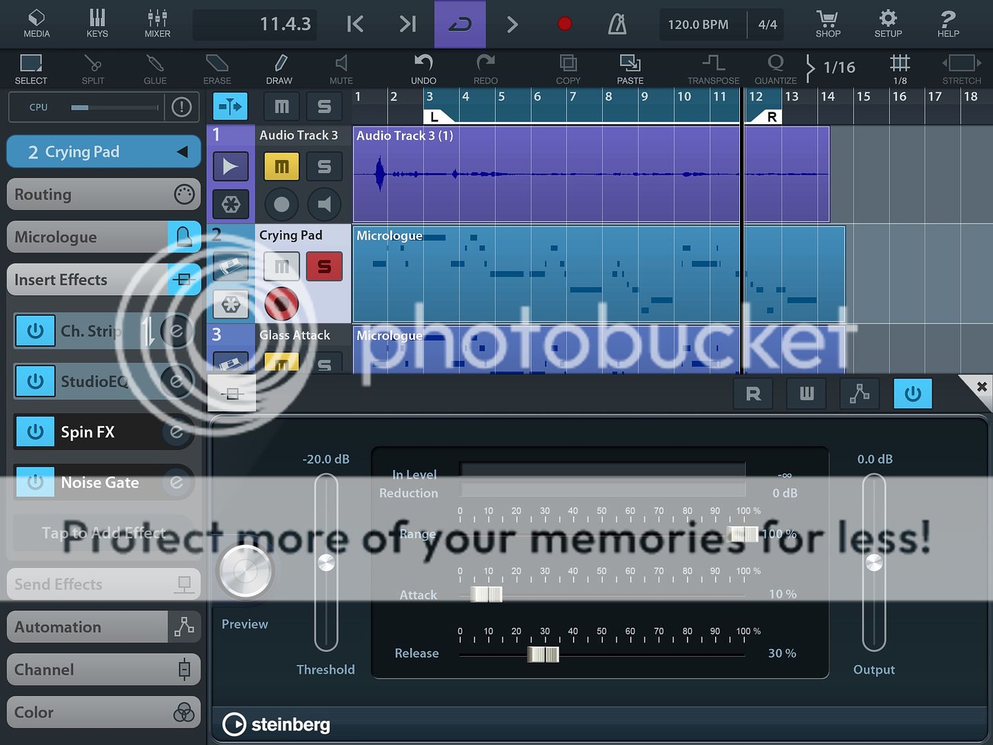
Here are a few more screenshots from v1:
https://macprovid.vo.llnwd.net/o43/hub/media/1093/11880/MIDI.jpg
(3D selected event and selected icon)
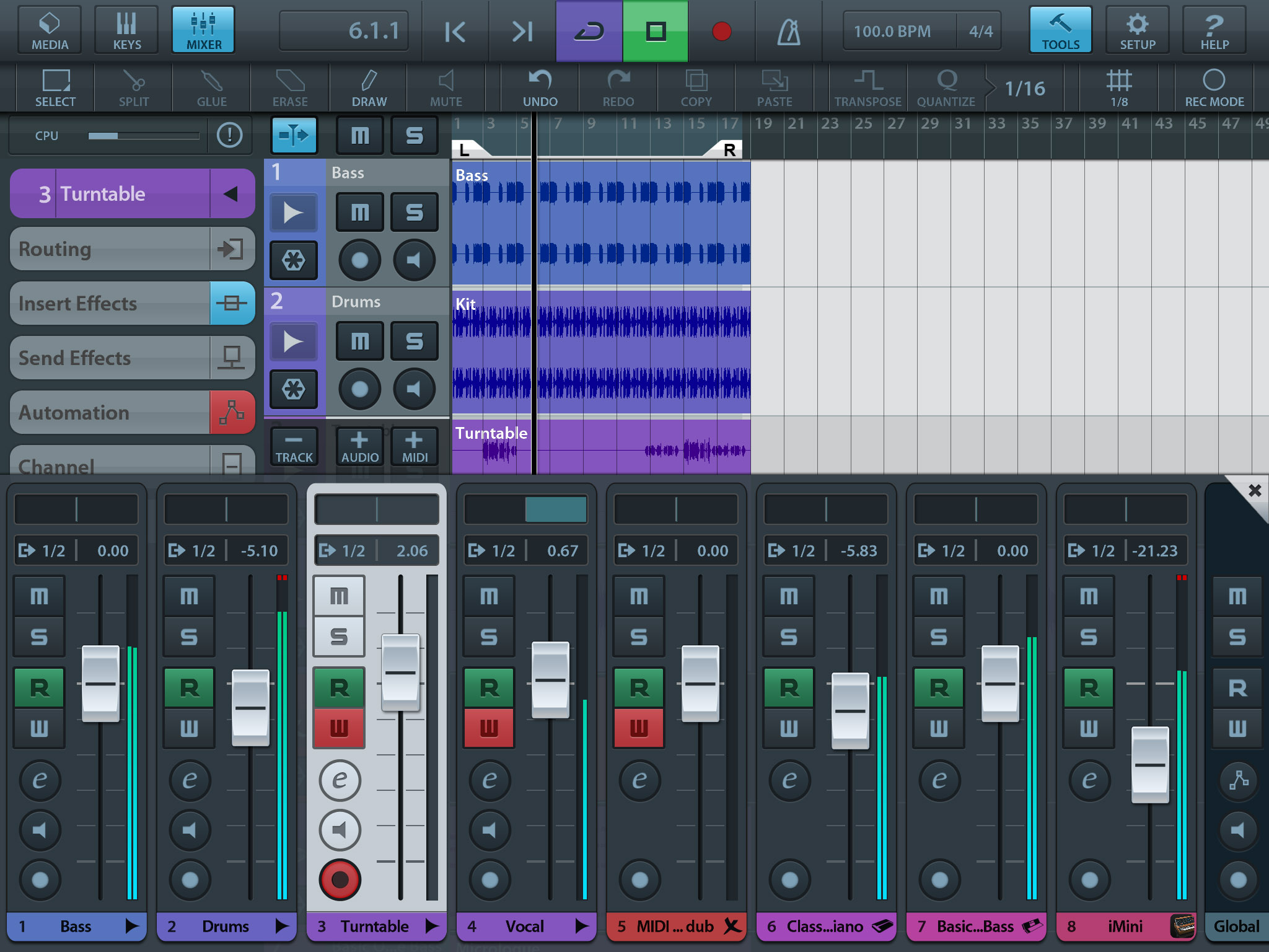
(rounded rectangle highlighted toolbar icons and 3D buttons in Mixer)
NOTE: In v1, the zero-position marker in the Mixer is thicker for a “visual cue”. In v2, all markers are of equal thickness.
A flat UI may be acceptable for a “productivity tool” such as a Word Processor but not for a Music Production app - which in the real world is a 3D object. In my opinion, there was nothing wrong with the ELEGANT v1 UI and there was NO need to revamp/change it in v2. Cubasis 2 looks inconsistent now with some controls/panels in 3D and some flat.
You could setup a Poll (along with v1 and v2 screenshots above), invite votes and and study user feedback.
CONFIG SETTING (recommended)
Cubase desktop app has an extensive color configuration module:

However, we do not need such complicated settings in Cubasis. Just background color, text color, 3D and rounded corners - or simply - one setting dropdown with these items:
Classic (v1)
Modern (v2)
The above setting should switch the UI and users will get a KICK out of the interface! It’s a BIG BANG from a small setting and minor code changes (similar to the new Background Color setting for the Arranger)!! Also, you get to RETAIN all the hard work you put into designing the v1 UI and continue to offer it as a preference setting without losing it. Further, you could gather ANALYTICS and insights into which UI (classic/modern) is most used by your users from their Settings.
HTH. Regret for the long message.
Please forward these suggestions/ideas to your IT team.
Thanks much!
Shekar